Opened 8 years ago
Closed 8 years ago
#7347 closed enhancement (fixed)
Accessibility: Improve color contrast of pending BP notifications bubble in Toolbar
| Reported by: |
|
Owned by: |
|
|---|---|---|---|
| Milestone: | 2.8 | Priority: | normal |
| Severity: | normal | Version: | |
| Component: | Toolbar & Notifications | Keywords: | has-patch has-screenshots |
| Cc: |
Description (last modified by )
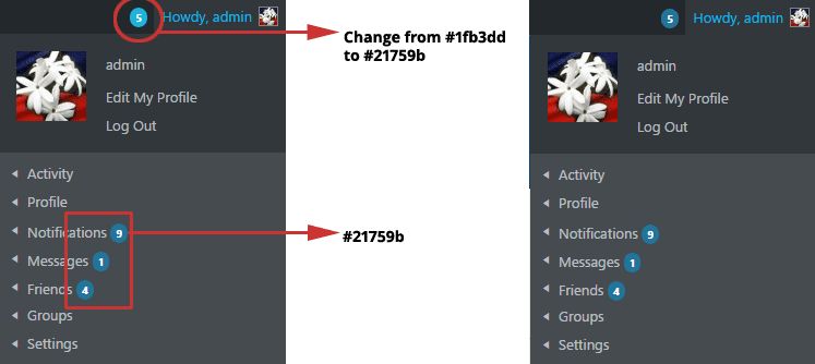
Current background color of the notifications bubble is #1fb3dd which has a contrast ratio of 2.46 -> way below the required 4.5 ratio for WCAG 2.0 AA conformance.
The image below shows the result of bumping the background color to #21759b (5.14 contrast ratio), the same color used for the spans on BP's member's account menu.
This second image shows an alternative background color for the notifications bubble -> #eee and font color to #000.
Attachments (1)
Change History (11)
#2
follow-ups:
↓ 3
↓ 4
 @
@
8 years ago
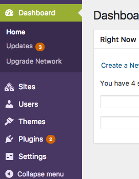
Can we match the colors used by WordPress's admin color schemes, and are those colors an acceptable contrast ratio?
#3
in reply to:
↑ 2
 @
@
8 years ago
Replying to johnjamesjacoby:
Can we match the colors used by WordPress's admin color schemes, and are those colors an acceptable contrast ratio?
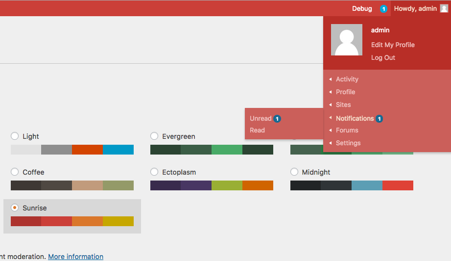
Yes please, a couple of example screenshots:
#4
in reply to:
↑ 2
;
follow-up:
↓ 5
 @
@
8 years ago
@slaFFik @johnjamesjacoby @netweb Thank you all for your feedback.
Replying to johnjamesjacoby:
Can we match the colors used by WordPress's admin color schemes, and are those colors an acceptable contrast ratio?
Unfortunately, the current background colors for the span count in all the 8 WP admin color schemes have insufficient contrast ratios.
Even if the admin color schemes were to be updated to pass required contrast ratios, we still need to provide our own background color for our own span counts or better yet, add one of the class names used in admin menu for the span count in our markup.
Image below shows what happens when we remove the font and background colors from BP's admin-bar.css without adding the new class name to BP's span count.
#5
in reply to:
↑ 4
;
follow-up:
↓ 6
 @
@
8 years ago
Replying to mercime:
Replying to johnjamesjacoby:
Can we match the colors used by WordPress's admin color schemes, and are those colors an acceptable contrast ratio?
Unfortunately, the current background colors for the span count in all the 8 WP admin color schemes have insufficient contrast ratios.
In that case a WP core ticket should be created for this then
Even if the admin color schemes were to be updated to pass required contrast ratios, we still need to provide our own background color for our own span counts or better yet, add one of the class names used in admin menu for the span count in our markup.
Once the upstream core ticket is resolved we can then use that class throughout.
Edit: A class/style will also need to be added for the buddypress.org theme also
#6
in reply to:
↑ 5
 @
@
8 years ago
Replying to netweb:
Replying to mercime:
Replying to johnjamesjacoby:
Can we match the colors used by WordPress's admin color schemes, and are those colors an acceptable contrast ratio?
Unfortunately, the current background colors for the span count in all the 8 WP admin color schemes have insufficient contrast ratios.
In that case a WP core ticket should be created for this then
Yes, planning on doing that later this week unless there's already a ticket in WP core regarding the whole set of the 8 admin color schemes.
Even if the admin color schemes were to be updated to pass required contrast ratios, we still need to provide our own background color for our own span counts or better yet, add one of the class names used in admin menu for the span count in our markup.
Once the upstream core ticket is resolved we can then use that class throughout.
Edit: A class/style will also need to be added for the buddypress.org theme also
Pls disregard the class name scenario. I don't know what I did the other night, but reviewing the stylesheets used in color schemes for the wp-admin menu span count this morning, the selectors used were too specific to the admin menu for us to piggy-back on as-is.


I like the new color (blueish, not #eee) more.