#6766 closed enhancement (fixed)
Companion Stylesheet - Twentytwelve
| Reported by: |
|
Owned by: |
|
|---|---|---|---|
| Milestone: | 2.5 | Priority: | normal |
| Severity: | trivial | Version: | |
| Component: | Templates | Keywords: | |
| Cc: |
Description
This ticket manages the Twentytwelve companion stylesheet implementation.
Twentytwelve is a relatively established WP theme and has been in use for some time and quite often is likely the starting point for a custom BP theme.
To minimize possible disruption to existing themes, styling is being reviewed and kept to a minium, against what we have done for the later WP default twenty* themes.
The first pass commit for the sass and compiled css files will be pushed up in a few days for iteration on and testing.
Change History (17)

This ticket was mentioned in Slack in #buddypress by djpaul. View the logs.
10 years ago

This ticket was mentioned in Slack in #buddypress by djpaul. View the logs.
10 years ago
#5
 @
@
10 years ago
#6
 @
@
10 years ago
@imath Thanks for the feedback & screenies.
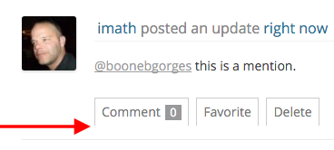
Chrome - bane of my life :( sadly though fine in FF, but induced by the companion styles where the button border issues exist, and the avatar issue is annoying.
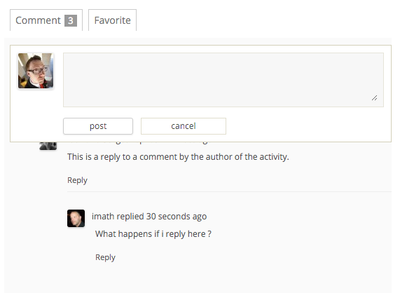
3/ Is actually by design the idea is that this affect of positioning is only described for the top level comments so positions the textarea below the original activity you are replying to so we can see that without needing to scroll back up, nested comment replies open to the bottom of the comments block. Perhaps this, overall, isn't a great idea? if opinion is against I'll remove.
#9
 @
@
10 years ago
@r-a-y Good spot! Thanks this is the sort of feedback needed, missed this, oddly?
Not sure really where best to deal with this, it feels more like a core stylesheet issue, rather than a companion sheet as we don't really deal with the acfb elements in bp styles and it's the theme styles providing these bullets and margins or not removing them.
Is styling for autocompleted users supposed to be full-width?
Would we rather it not be? How would we style? If auto width names will vary in width, possibly looking messy? Be interested in thoughts, personally I would leave as full width but not a fan of the heavy background.
#13
 @
@
10 years ago
Hi hnla,
I noticed an issue with responsive images in the activity stream with Twenty Twelve.
Twently Twelve sets each image (and iframe, embed, object, video) with max-width: 100%. However, it does not set the height, so images are stretched vertically. You can test by pasting any large image oEmbed URL from Flickr, Smugmug, Photobucket, etc.
I would recommend the following CSS declaration for images:
.activity-inner img {
	height: auto;
}
The stretched height issue can still be found with other responsive media (iframe, embed, object, video), but it is not as noticeable. This could be fixed by removing the max-width declaration, but this will crop the embed item horizontally.
#14
 @
@
10 years ago
Another good spot, easy to overlook as height: auto is sort of expected.
Half wonder whether this shouldn't really be an update for 2012 to add, but yes agree we'll cover things for BP as you show above.


In 10404: