#6171 closed enhancement (fixed)
Welcome Screen for BP 2.2
| Reported by: |
|
Owned by: |
|
|---|---|---|---|
| Milestone: | 2.2 | Priority: | normal |
| Severity: | normal | Version: | |
| Component: | Core | Keywords: | |
| Cc: | keepingcozy@… |
Description
Attachments (2)
Change History (26)
#4
follow-up:
↓ 5
 @
@
11 years ago
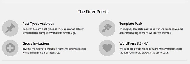
Thanks a lot jjj for updating the welcome screen. Looks great and very clean. Just 1 point about the layout: the 4 dashicons are 'far' from the title of the 4 finer points, is it on purpose ?
#5
in reply to:
↑ 4
;
follow-up:
↓ 7
 @
@
11 years ago
Replying to imath:
Thanks a lot jjj for updating the welcome screen. Looks great and very clean. Just 1 point about the layout: the 4 dashicons are 'far' from the title of the 4 finer points, is it on purpose ?
Nope. :)
What OS and browser? They should be centered and uniform and symmetrical.
#7
in reply to:
↑ 5
 @
@
11 years ago
Replying to johnjamesjacoby:
What OS and browser? They should be centered and uniform and symmetrical.
#9
 @
@
11 years ago
Looks nice!
I have a couple of points:
Member Types - IMO, the description needs to be altered slightly. When a non-dev site administrator reads this and sees the graphic, it can have the connotation that Member Types is heavily integrated into everything BP (registration, xprofile) when it isn't yet.
Not sure what to add for text though. Here's an attempt:
We're laying the groundwork for Member Types in BuddyPress 2.2.

Currently only available to developers, registering member types allows communities to start categorizing and querying users by different types.
Complex Activity Queries - excluding activity-related stuff, same also applies to XProfile (r9178).
#10
 @
@
11 years ago
there's actually a trouble when the about page is displayed in the network admin see 6171.multisite.patch
#12
 @
@
11 years ago
- Owner set to johnjamesjacoby
- Resolution set to fixed
- Status changed from new to closed
In 9421:
#15
 @
@
11 years ago
- Resolution fixed deleted
- Status changed from closed to reopened
imath's patch to deal with multisite wasn't included in the most recent commits. Reopening so it's seen.
Also, view my feedback in comment:9 if it's valid or not.
#16
 @
@
11 years ago
For consideration: Add back "Go to the BuddyPress Settings page" link at the bottom of the About BP page per attached screenshot. edit - or something to that effect :)
#17
follow-up:
↓ 18
 @
@
11 years ago
- Cc keepingcozy@… added
Sorry, I'm a bit late to this party. Just tested 2.2 RC2. The only feedback I have is that the member types image looks a little lonely in the center at ~300px - might want to make that a little wider if possible.
#18
in reply to:
↑ 17
 @
@
11 years ago
Replying to pollyplummer:
Sorry, I'm a bit late to this party. Just tested 2.2 RC2. The only feedback I have is that the member types image looks a little lonely in the center at ~300px - might want to make that a little wider if possible.
Call me old fashioned, but I kinda like it small and proud. Willing to concede to stronger opinions though.
#19
 @
@
11 years ago
+1 for link to settings screens
Tend to agree with r-a-y that we could perhaps adjust the user type explanation - perhaps with a little more emphasis on what might be provided as things progress with this or what eventually an admin user might have available?
We're building the foundations for a Member Types API in BuddyPress 2.2.
The initial implementation allows for a member type to be registered. Developers will be able to start to use this in their plugins or site functions to categorize & query users by these types.
This API will continue to be expanded on with the eventual aim that a robust user interface will exist to allow setting a 'type' from the user settings screen.
#20
follow-up:
↓ 23
 @
@
11 years ago
Too late for any string changes unless it's really really critical.
I don't think it's likely that anyone who reads the wall of text on the welcome screen will then notice a small link at the bottom of the page for settings. I personally don't like the settings link here, it looks like an after-thought, so if it's gone, I'd rather we leave it out for now.
#23
in reply to:
↑ 20
 @
@
11 years ago
- Resolution set to fixed
- Status changed from reopened to closed
- Type changed from defect (bug) to task
Replying to DJPaul:
Too late for any string changes unless it's really really critical.
I don't think it's likely that anyone who reads the wall of text on the welcome screen will then notice a small link at the bottom of the page for settings. I personally don't like the settings link here, it looks like an after-thought, so if it's gone, I'd rather we leave it out for now.
Agree about the settings link. I think I silently yanked it a while ago.
Closing this, as everything we agree on is complete. Thanks for chiming in everyone.


In 9418: